Bright and Fun Vector Branding for an Imported Japanese Snack Company
Intro
The idea for Sugoi, a fictitious Japanese snack box company, came to me faster than any other project. Assigned with designing and developing a brochure, it took 10 minutes into the project introduction before I was sketching concepts in my sketchbook.
Design Approach
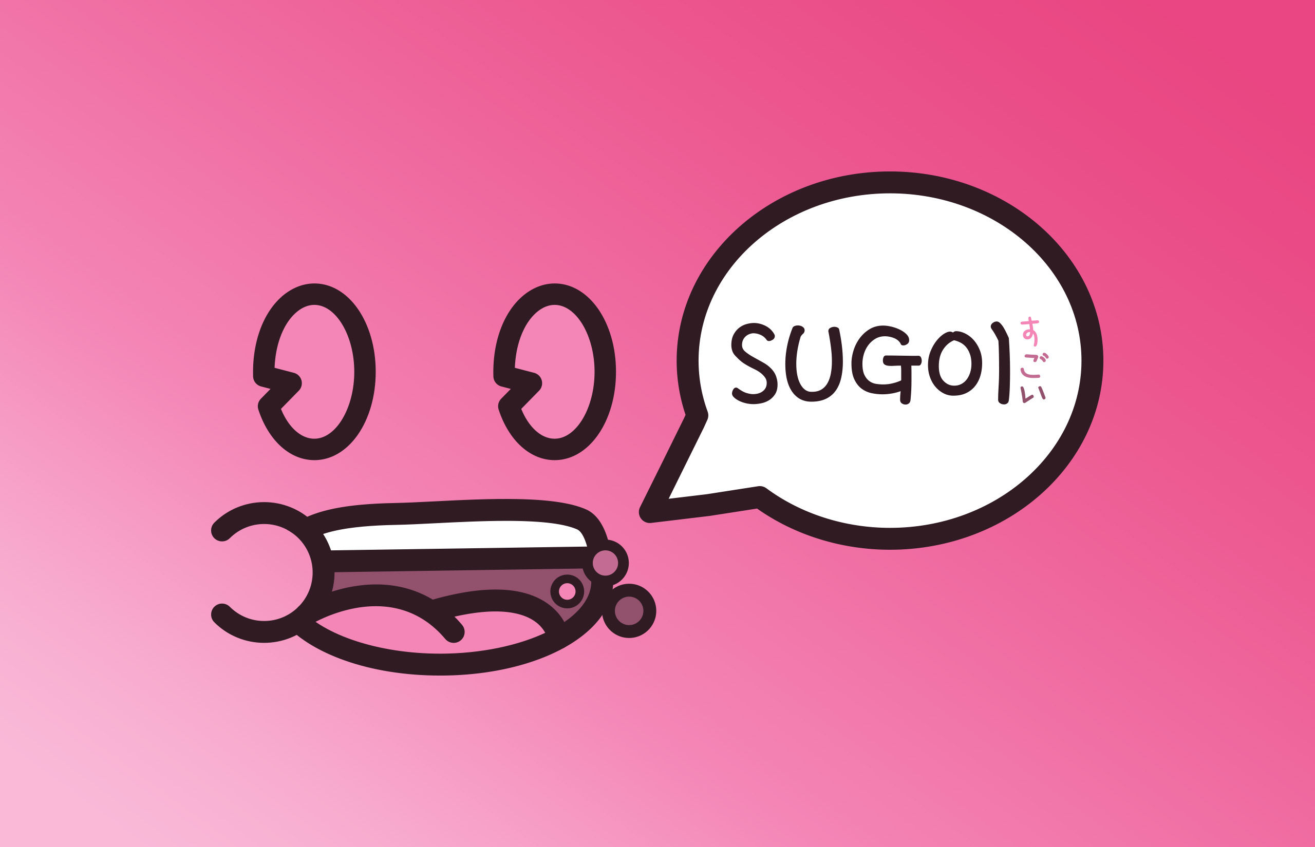
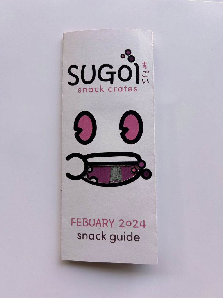
Going into this project soon after my Poser project, I was ready to scratch my vector itch. During my initial sketches I drafted the idea of Sugoi, a monthly subscription box service delivering Japanese imported snacks to customers with a special theme every month. Since February was coming up, I decided the theme should be Valentine’s Day and challenged myself to use a color I’ve never experimented with, pink. I researched and gathered inspiration to get a feel for the current market and then returned to my sketchbook. When I started drawing logos, I had the idea for a vector face to be the main identifier of the brand.
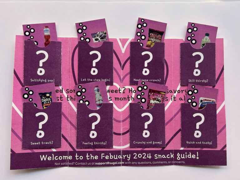
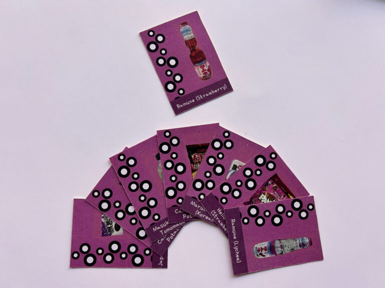
With the sketches and early direction done, I took to illustrator to take my sketches digital. I explored a specific cartoon style for the mark featuring thick strokes and simple details. To design the wordmark that would accompany the face, I revisited my type cards and used Gamja Flower, a font featured in that project. I then took three dots that were featured in my vector as another brand element and incorporated it into my wordmark as well. With the branding finalized, I began fleshing out my brochure idea and decided on a closed gate fold featuring 8 pockets that have a trading-card style insert featuring a picture of a snack and its nutrition facts. One of my initial ideas was to feature a die cut that when a card from the inside got removed, would feature a secret message that would be based off the monthly theme. To execute this, I planned the die cut and placed the message on the backside of one of the pockets. After finalizing all the design, both inside and out, it was time for physical production.
Wrapping Things Up
This time around, having more experience with printing, I avoided all major printing problems and had a smooth production. Overall, the branding for this project is one of my favorites I have done so far. I had so much fun fleshing out the logo system and designing a brochure around it. This project gave me a unique chance to try something different for an editorial project, one where the focus was heavily on the construction of the final. To adapt to this I had sketch out the format from the start and plan things out accordingly while also thinking in 3d on how to execute it.