Coil Hair Care
Creating a Series of Package Design for Hair Care Products Targeted at Men With Curly Hair
Intro
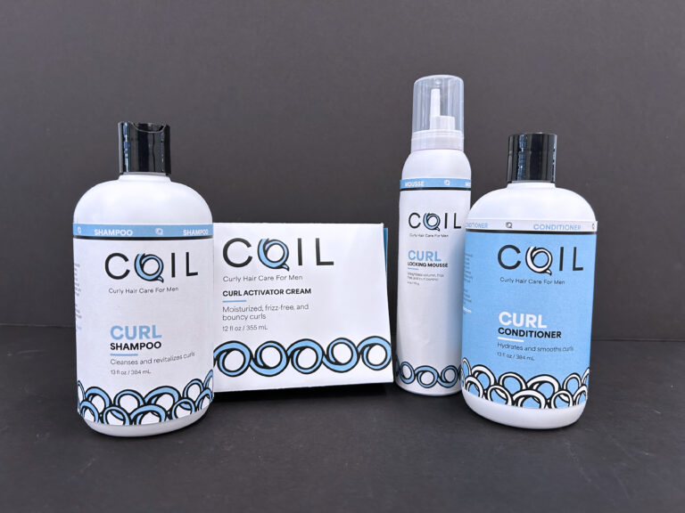
Tasked with creating a series of packaging designs for a variety of products from a limited set of categories, I decided to develop designs for hair care products. For this project I wanted to create my ideal product, a hair care product targeted towards men with curly hair. And with that concept, Coil was born.
Design Approach
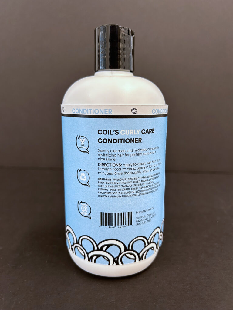
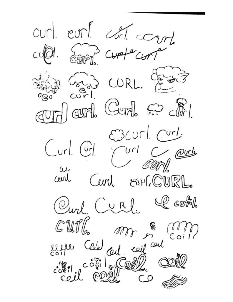
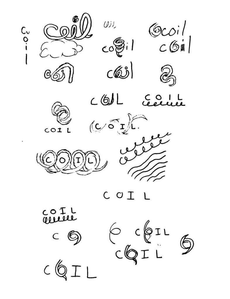
Creating the branding for Coil took some time to get rolling. After researching the current market of men’s hair care, they all seemed very minimalist and boring, so I wanted to add some fun element to set my product apart from others on a shelf. With this, I explored multiple concepts while sketching and ultimately landed on including a curl as the “O” in Coil. With the branding done I decided on the products I wanted to make packaging for. These products included a curl activator cream, shampoo, conditioner, and mousse.
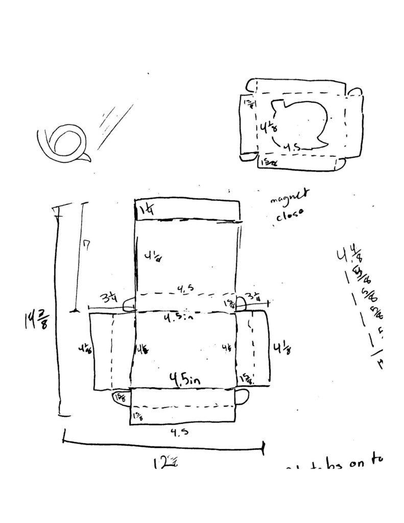
To keep consistency between products I created a pattern across each hair care product. To flesh the brand out further, I created an alternative line of hair care products for different types of curly hair, those being curly, wavey, and kinky, differentiated by color and pattern. All three would keep the consistent branding while being able to tell that they were apart of different lines of products. After finishing the design for the packaging, I began prototyping and ran into problems with my curl activator cream box, however after some fixes with measurement mistakes, I was able to create the box as planned.
The next part of the project was to create a poster advertisement and Instagram reel. For the poster I created the copy and began formatting the advertisement. I used my messed-up hair to combine real and cartoony elements, an idea I would use in my reel as well. For my reel, I wanted to explore animation and created a 45 second ad for the curl activator cream and a step by step on how to use it.
Wrapping Things Up
I had a lot of fun with the branding for Coil. The inclusion of the curl pattern separates itself from traditional men’s hair care and would help to stand out on store shelves. Creating a series of products was very helpful in practicing cohesion across not only different product types but also the same product type that targets a different aspect, in my case curl type. Overall, Coil was an enjoyable experience that allowed me to explore more about packaging design, which is something I enjoy creating.
