Could Drawing Tablets
Representing Creativity and a Passion to Inspire in the Form of a Box
Intro
Having no experience with package design prior, the assignment of developing brand identity and package design for a fictitious brand created by myself left an intense challenge for me to face and of course I took the bait. Could, an affordable drawing tablet company with a focus on quality for a fraction of the price, was my brand of choice. The choice to do an affordable drawing tablet company came due to my $30 drawing tablet recently breaking around the time this project was assigned.

Design Approach
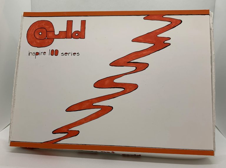
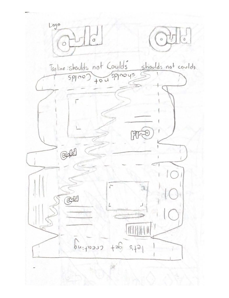
Developing the logo would be the first step to establish the brand ident for Could. The concept for the logo would be both friendly and unique, playing with the letterform’s size and width to make the logo stand out among other drawing tablet brands such as Wacom and Huion whose logos are more geometric and blander. The original requirements for the project would be a box, bag, and a 2-dimensional elemental that would need to be handmade. All design elements needed to be drawn and type needed to be hand lettered. The box, bag, and box insert would need to be measured, prototyped, cut, and folded by hand to create the box. The first thing to figure out would be the measurements for each product. I based the measurements of the box off the broken tablets and after prototyping the measurements I landed on 11in x 8in x 1in. Based off these measurements, I designed the bag to be 10in x 3in x 12in and the insert to be 8in x 3in.
After continuously recreating the box in a multitude of materials such as paper, cardstock, and thin foamboard, I made final tweaks to some measurements and began implementing my design onto the final material. The original cohesive set of products I designed and developed was my first exposure to package design and creating for a 3D space, so it was extremely experimental but also fun and challenging. Learning the best materials to use, adjusting my measurements as needed, and creating that final product were all enjoyable and kept me driven to the final presentation was delivered. However, despite that this exposure to package design left me wanting to explore further.
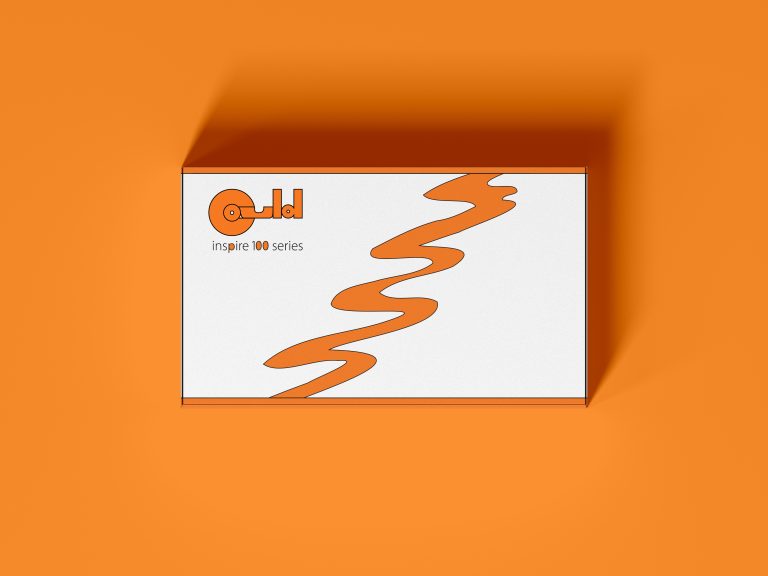
To expand on this project, I revisited it later and digitized my design. This expansion reinforced skills already familiar to me as a designer, digitizing my idea. Starting by using Illustrator for the logo and vector elements, I scanned the original logo and recreated it into a vector design. I then recreated the curvy line element used throughout my design and moved both into InDesign. Using the measurements of my box I recreated my box template and began working on moving my design over. The process went smoothly, and the final design was finished in a timely manner.
Wrapping Things Up
This original exposure to package design still piques my interest to dive deeper into the intricacy of designing for a 3-Dimensional space. This project was challenging and forced me to test, re-evaluate, and test some more. The process, although time consuming, was very rewarding and left me proud of my packaging and branding. The enjoyment I had while developing the drawing tablet box leaves me excited for the future and hopes that more package design opportunities will present themselves to me, leaving more challenges to design solutions for.