Designing Colorful Bills With Dynamic Layout to Represent Pawtucket, Rhode Island
Intro
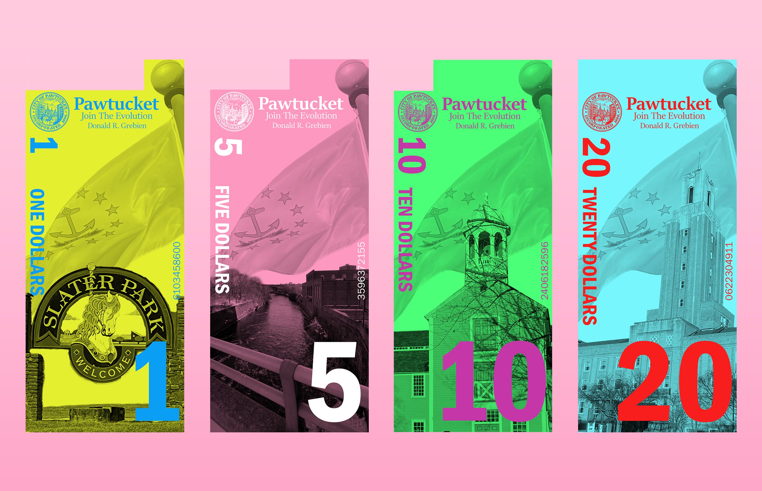
Tasked with the creation of currency for a town or city, I knew I wanted to design the money around my hometown, Pawtucket, Rhode Island. Originally there weren’t many ideas that came to mind for how to design the layout and format of the currency, so inspiration was a big help to get the ball rolling.
Design Approach
Personally, the currency used in the U.S. is quite bland, so I looked for beautifully designed money in many different countries. The biggest appeal to me was the use of bright colors other countries use to represent their different bills. Knowing the color direction, I wanted to go, I walked around Pawtucket to find landmarks that I wanted to show on the bills. If you know Pawtucket, then it’s no surprise that there isn’t much going on and growing up there, but I still found significant landmarks to put on the bills. While walking I took images that would later be used in my design as it was required that all imagery be original. Some other requirements for the project were the inclusion of the seal of the city, name of the city and current mayor, and designs for a $1, $5, $10, and $20 bill.
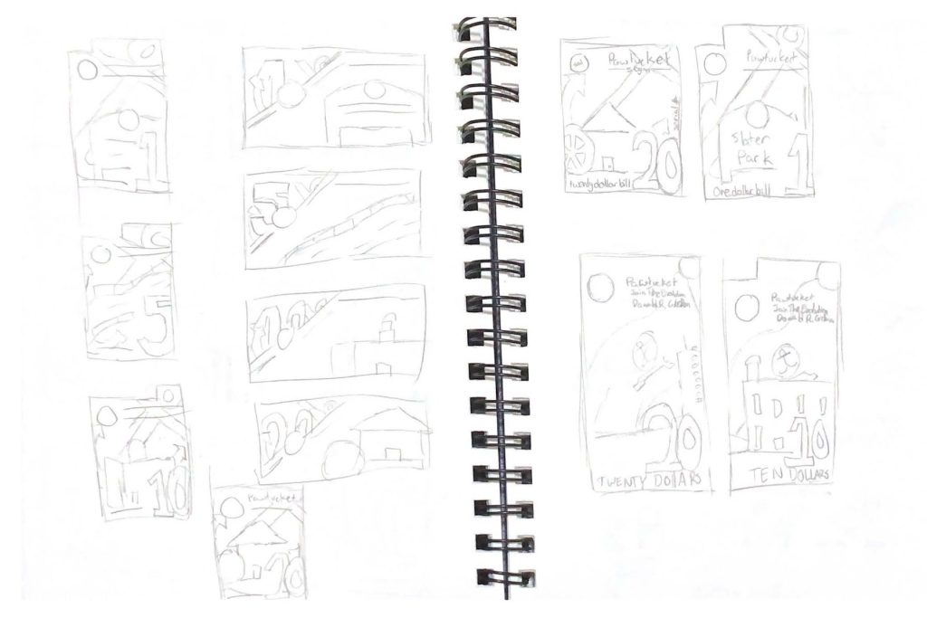
After sketching out some concepts, there was a unique cutout idea that I decided to include on the bill. Each value would have a different size cutout on the top of the bill, helping to differentiate values if someone were to have a visual impairment. With the layout sketched out I was time to take it digital.
Using Adobe Photoshop, the early on construction of the layout came without issue. After designing the first two bills, $1 and $5, I test printed and found a major problem with the coloration of the money. The colors were dark and looked nothing like the colors picked for the designs. The issue was solved after it was found that the use of blend modes was messing with the printing. After that little scare, the development of the remaining bills was tackled and completed.
Wrapping Things Up
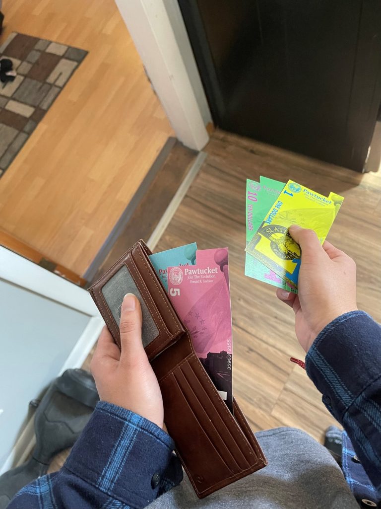
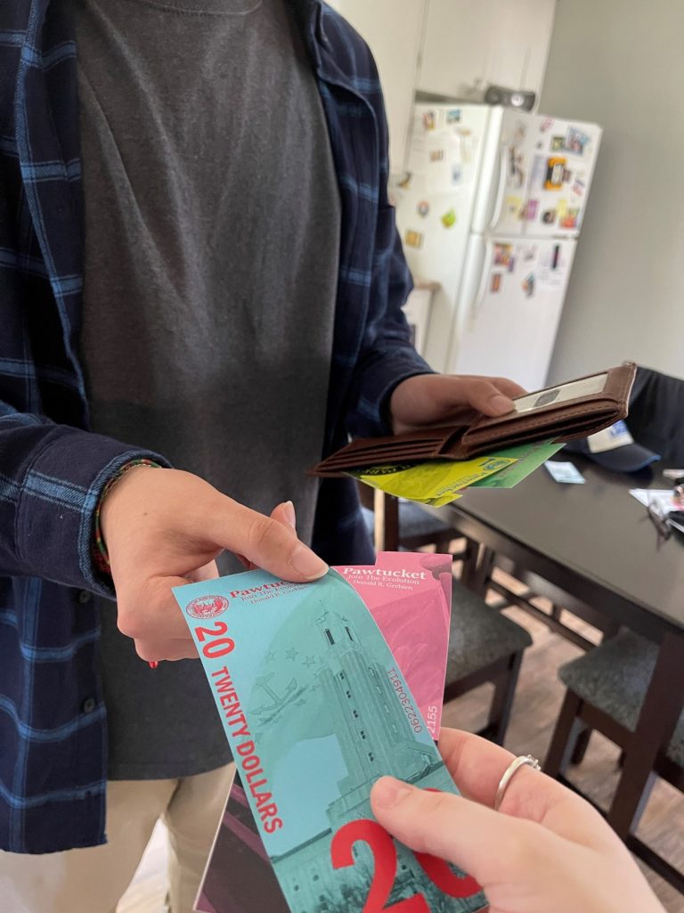
With the prints going a lot smoother the final time around, the money was cut using an X-acto and was used in images displaying it in use. The currency project was fun to design and a milestone in developing my knowledge of Photoshop. I enjoyed representing the city I grew up in and playing around with color and layout to create consistency on the bills. Overall, the currency design shows both creativity and usability, while helping further strengthen my skills as a designer.