Expanding Knowledge of Vector Illustrations Through Brand Development and Cohesion
Intro
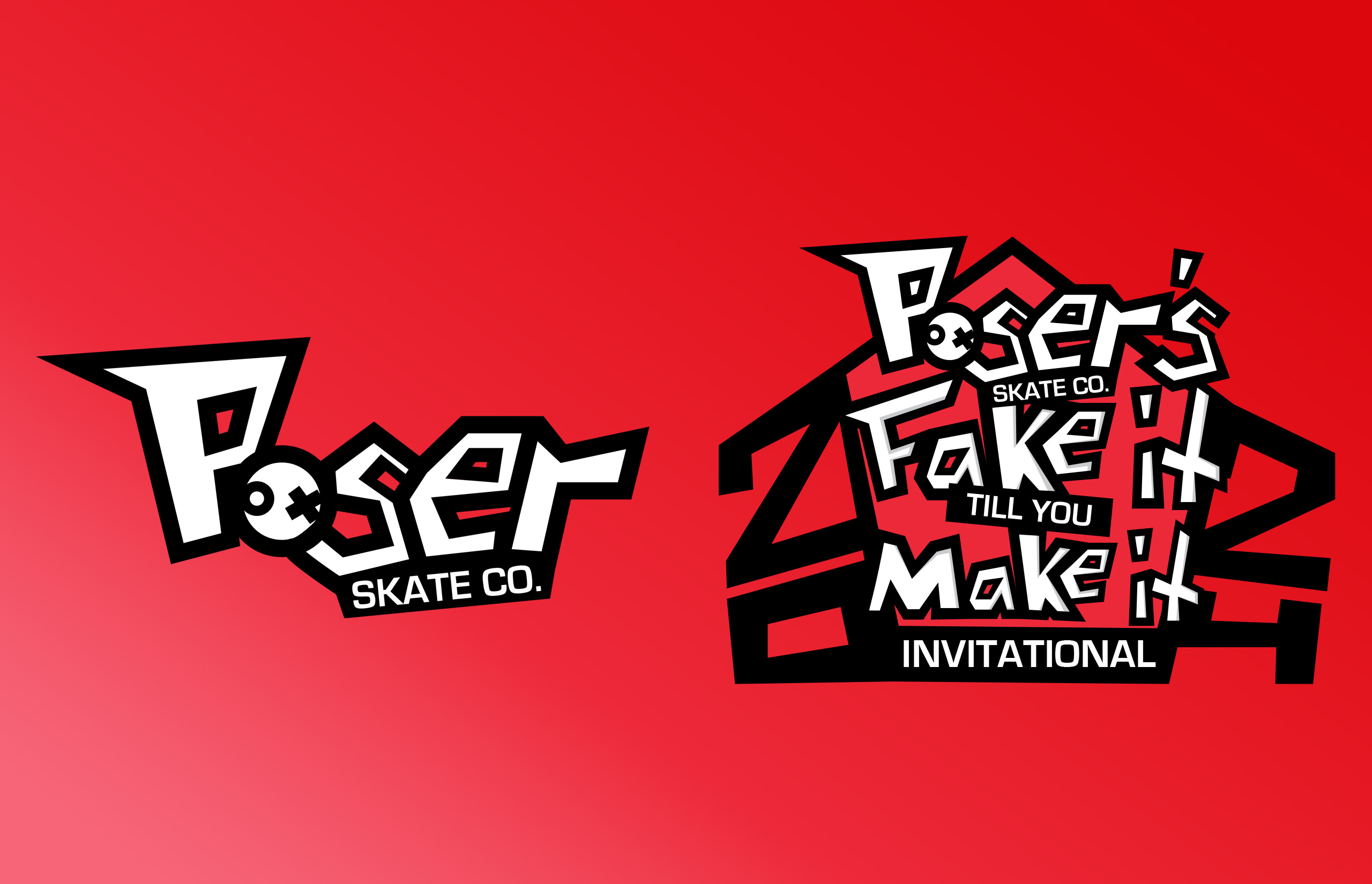
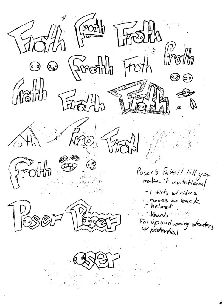
When assigned with the development of a fictional brand, I wanted to use this opportunity to expand my skills and technique on vector illustrations. Beginning with brainstorming, I initially came up with a surfing company due to the idea that making surfboard designs around an illustration heavy branding would make for a fun and unique project. After some time and consideration, I made a not so big jump over to a skateboard company named Poser Skate Co. The idea for this project would be to build the branding of Poser and then create branding for a fictitious event that Poser would host called “Poser’s Fake It till You Make It Invitational.”
Design Approach
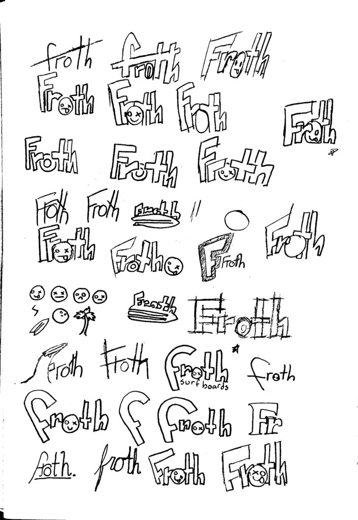
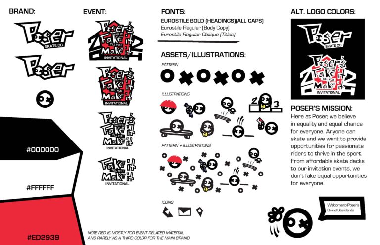
Going into this, I knew I wanted to create a unique logo that would stand out from another brand I have created. When originally sketching concepts for the surfboard brand I landed on an idea that would spark the design of Poser’s logo, a wordmark made of custom letter with a circular mascot that would replace the “o.” After getting a solid idea and direction, I moved to illustrator and began my logo drafts. Using the pen tool, I created custom letters that were edgy and modern and found a readable sans-serif to compliment the style and to be used on editorial material that I would create later. To focus on the illustrations and appeal to my target audience I opted to use a simple black and white color palette for the main branding which allowed for the brand to look clean and simple.
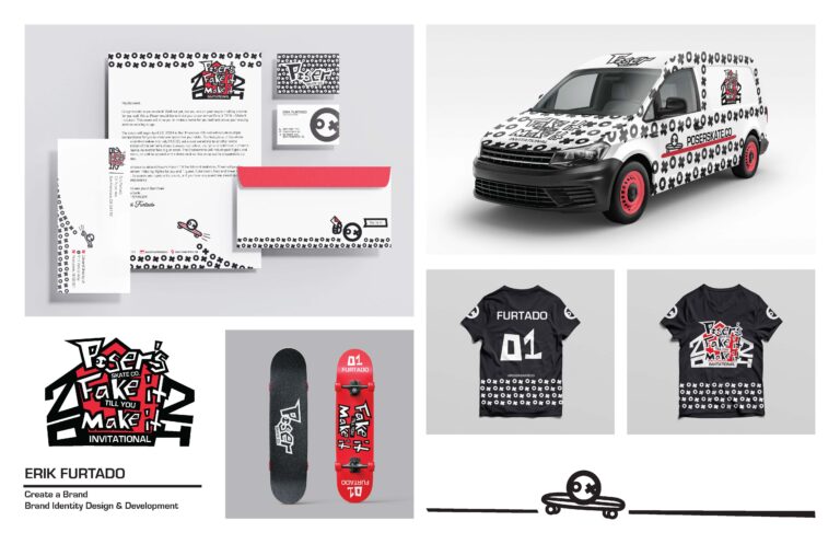
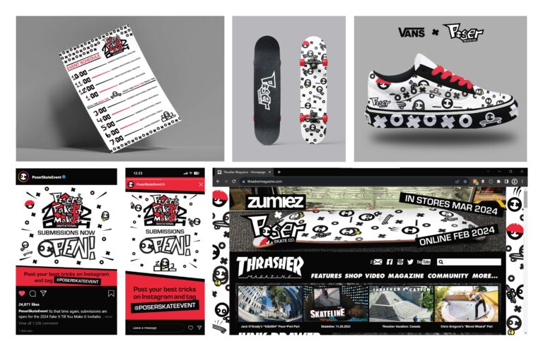
For the event branding I revisited the pen tool to create more letters in the unique style of the logo. To help in differentiating the event from the main brand I added red to the color palette and used it as the color of the badge for the event. Once the branding was finished for both Poser and the event, it was time to begin creating a cohesive set of deliverables. Since it was an invitational event, I first began with an acceptance letter into the event and designed a letterhead for it as well as an envelope. I then made an editorial piece in the form of an event schedule. Throughout this development I am using Illustrator to make vector illustrations of my mascot, who I named “ox” due to his “o” and “x” eyes, that is used on all collateral pieces to ensure cohesion. My number one priority when developing the deliverables was to ensure each piece was cohesive with each other as that is a very important step towards branding that can sometimes be overlooked. As I continued to develop my deliverables such as a t-shirt for the event participants and skateboard designs, I made sure they all looked apart of the same brand and didn’t steer away from the brand standards I had developed for Poser.
Wrapping Things Up
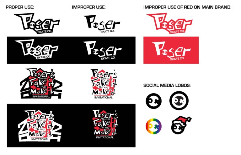
As the development of Poser and its deliverable came to a close, I designed Poser’s brand standards and the do’s and don’ts for the brand identity. Looking back at this project, I had a lot of fun making the illustrations and that enjoyment would fuel my experimentation with vector for future projects. This project gave me the opportunity to expand my knowledge on brand cohesion and the thought behind building a brand. The expansion of Poser seems limitless, and I plan to develop it further as this project has been approved to be presented at the JWU Design Senior Show. Vector illustration is a strong skill I’d like to learn, and this project was the first steps to learning, understanding, and creating my own style of vector and I cannot wait to continue to develop my skill.