Designing Fun Packaging for a Healthy, Protein Filled Snack Using Branding, Color, and Out of the Box Thinking
Intro
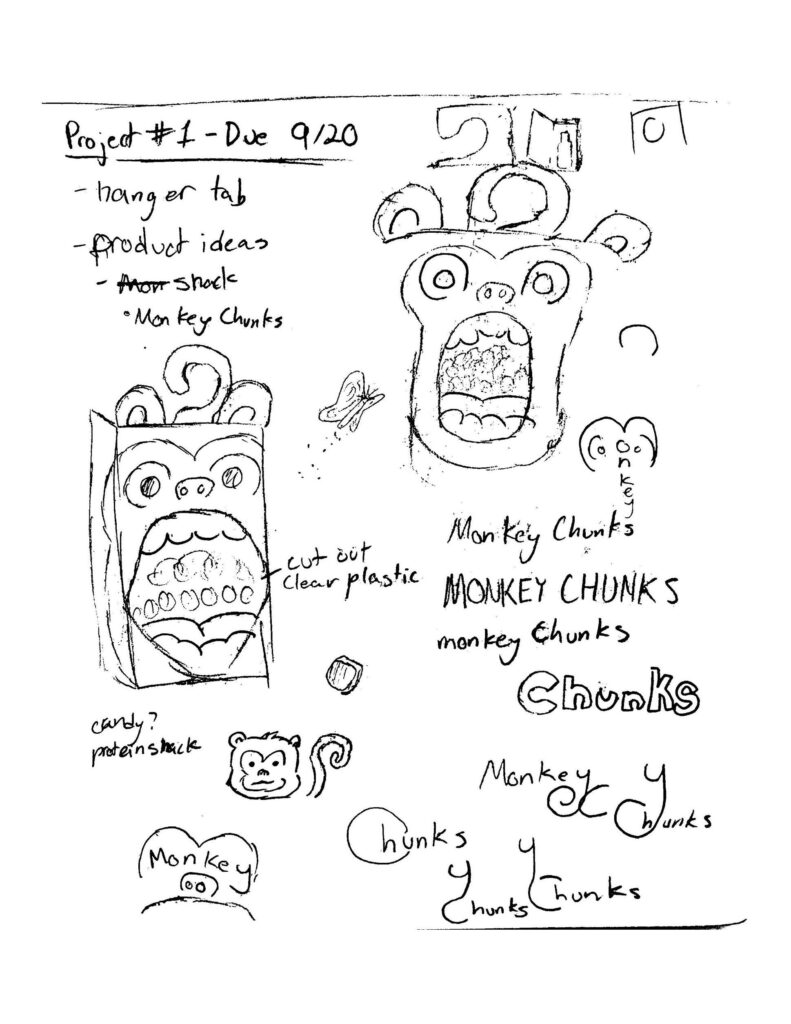
As an introduction to packaging, I was tasked with the creation of a package that included a hanger tab. This project would include the development of a fictional brand from scratch and a package design with a functional hanger tab. Very soon after this project was assigned, I decided on my brand.
Design Approach
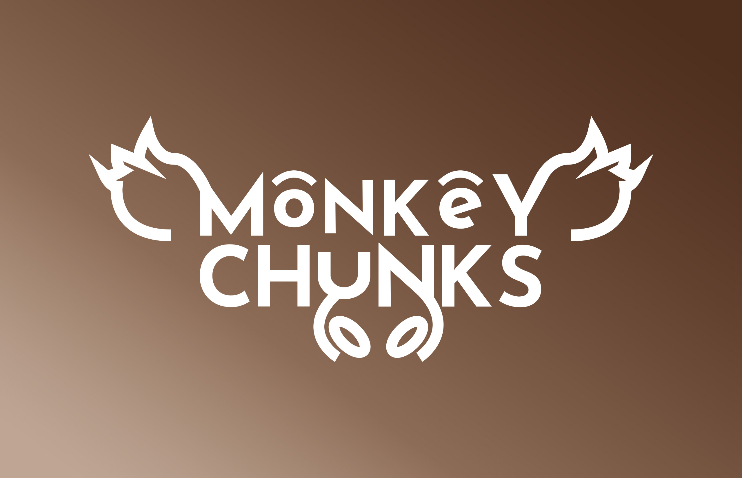
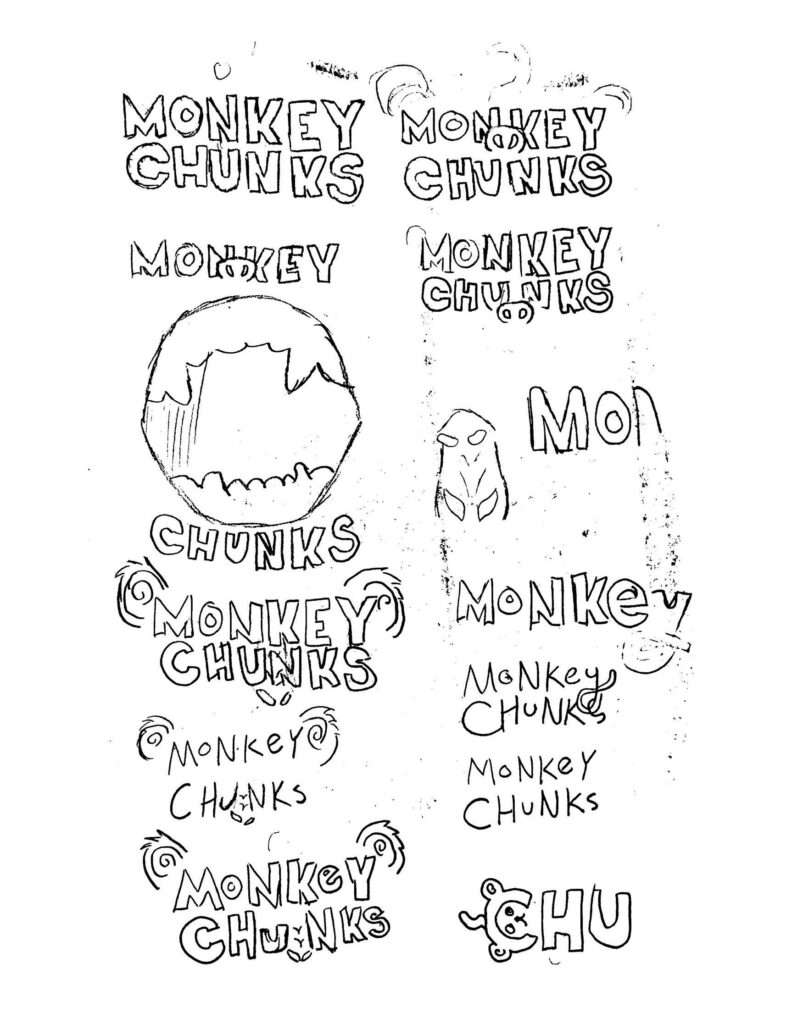
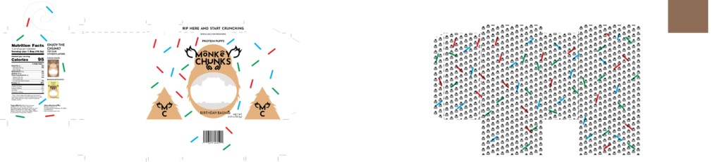
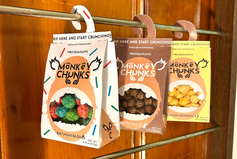
The idea was a protein puff snack called “Monkey Chunks” with the package being designed after the monkey’s face and having the hanger tab be its tail. Having a strong direction from the start really helps but my first steps was to get my ideas on paper. After sketching concepts for the package shape and design I began work on the logo. Creating a logo was an important step in this project as I needed it to convey protein rather than candy or some other snack. It was also important for me to incorporate the logo into the packaging as I wanted them to interact with one another. However, I also needed to design the logo in a way that it could stand on its own without the packaging. I initially struggled with the development of Monkey Chunks’ logo and it had me constantly revisiting and tweaking it. Ultimately, I landed on a design featuring edgy letters and line elements that depict a monkey’s face.
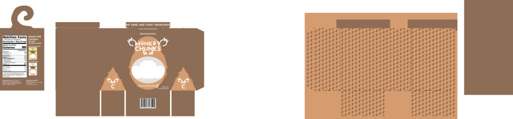
With the logo finished, it was time to begin designing and laying out my package. Following my initial sketch ideas, I designed the front of the package first. My idea was to feature a monkey face with an open mouth that I could die cut and place acetate in for a clear view of the snack. After the front was completed, I fleshed out the rest of package and developed the tail shaped hanger tab. I then created a vector icon to represent the flavor and used it to create a pattern on the inside of the package. Although only required to design one package, I opted to expand my product into a series, featuring three different flavors, cocoa craze, banana bonanza, and birthday bash with the visual coding that would separate them being the color and design of the monkey’s fur. Although the cocoa flavor had plain brown colored fur, I explored some creative designs for the other flavors such as sprinkles for birthday cake and yellow fur with a brown tail for banana.
Wrapping Things Up
Constructing the packaging was a challenge as I decided to make a bag style package, the folding took some time to learn. I also had an issue keeping the package closed but ended up using double sided tape as a temporary fix. Overall, I find packaging extremely fun and rewarding. The satisfaction of prototyping till you get something right is unique and I enjoy problem solving. The brand and package design for Monkey Chunks is a prime example of how I like to design, unique, interactive, and cohesive. I love out of the box thinking and designing my way out of difficult problems and package designs like Monkey Chunks let me scratch that itch.