Event Poster
Spreading the Word of Otakuexpo Through Story and Editorial Design
Intro
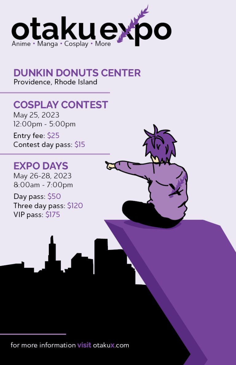
When assigned with designing a series of event posters for a fictitious event of our choosing, excitement overwhelmed me as I began brainstorming the event to create. Ultimately, I landed on Otakuexpo, an anime convention that takes place in Providence. Due to many major anime conventions and expos being in major places like New York and California, I wanted to create one local to me and make it my dream convention. Designing for a target audience of teens and young adults interested in anime, manga, and cosplay was interesting considering I fall under this demographic. Knowing the interests firsthand would assist the development of this poster series.
Design Approach
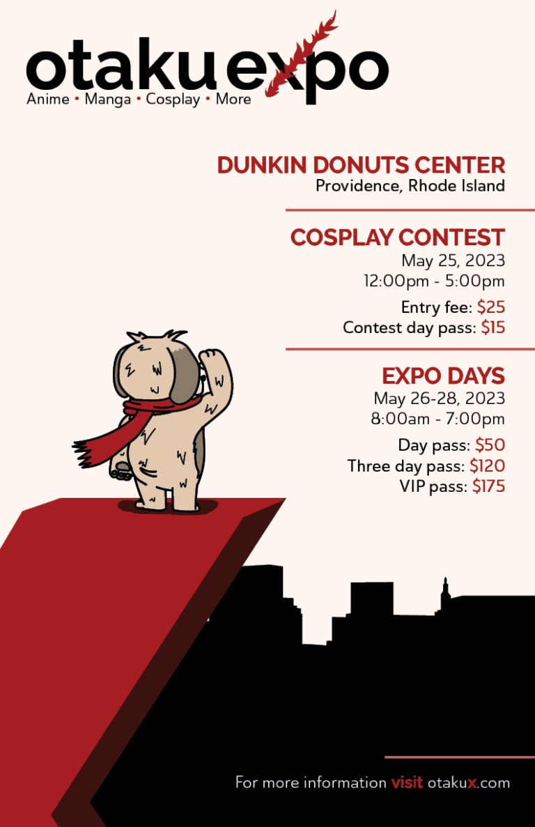
With the excitement only growing, I drafted concepts for poster layout while also doing research of similar events. One key feature that stood out was that most major anime conventions included an original character, or characters, as a mascot. After researching the different mascots, I landed on the idea of two mascots, a young male and a dog. Using these mascots to inspire my layout, I continued sketching and landed a concept to pursue
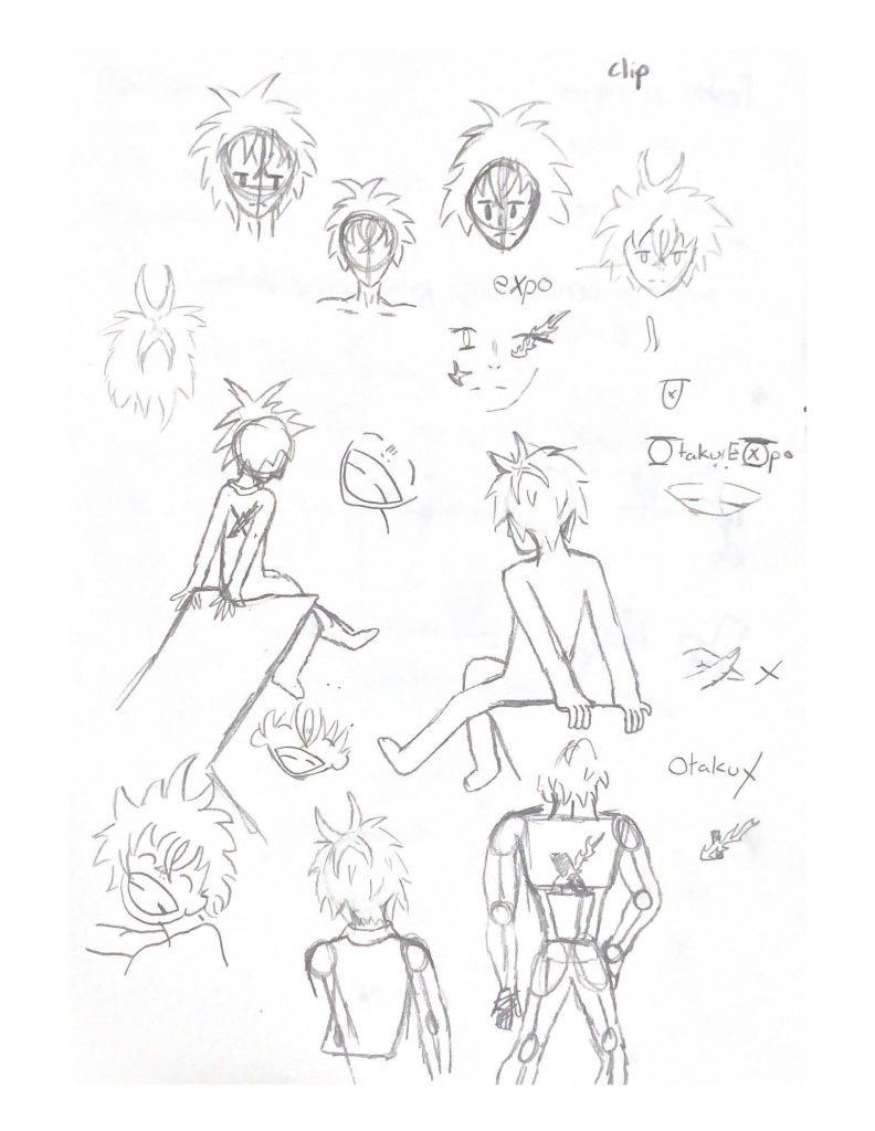
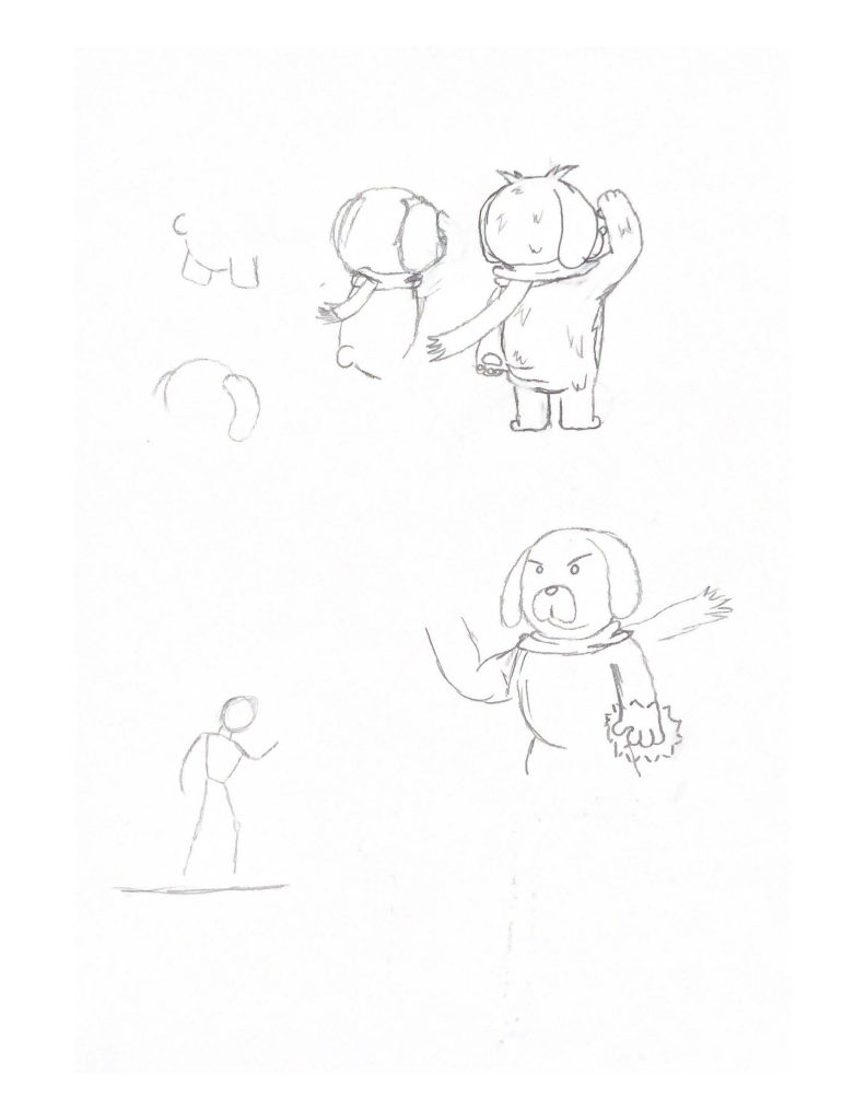
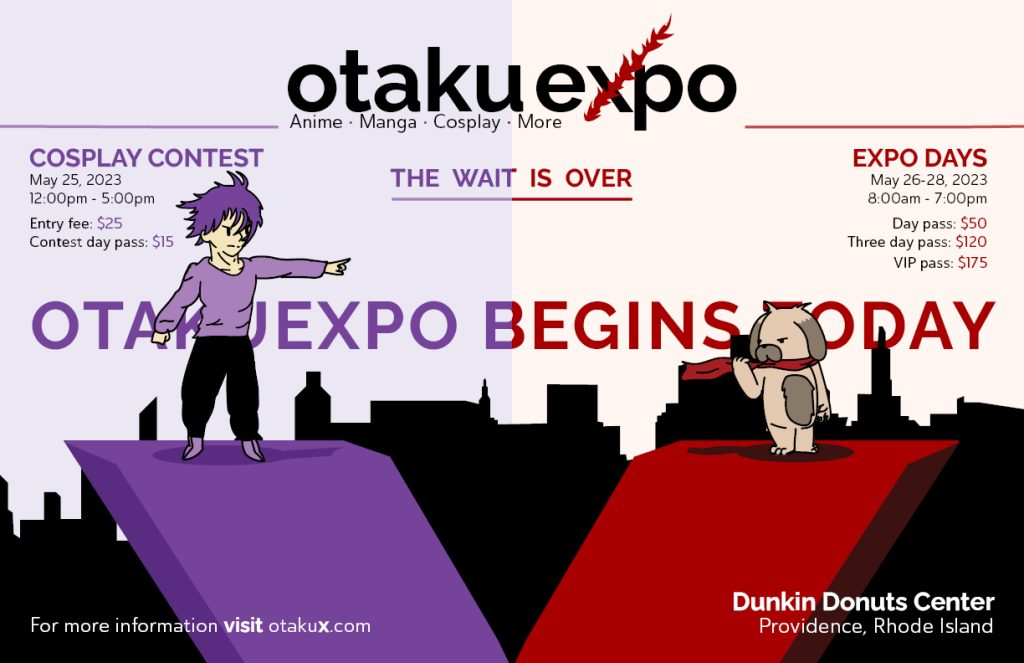
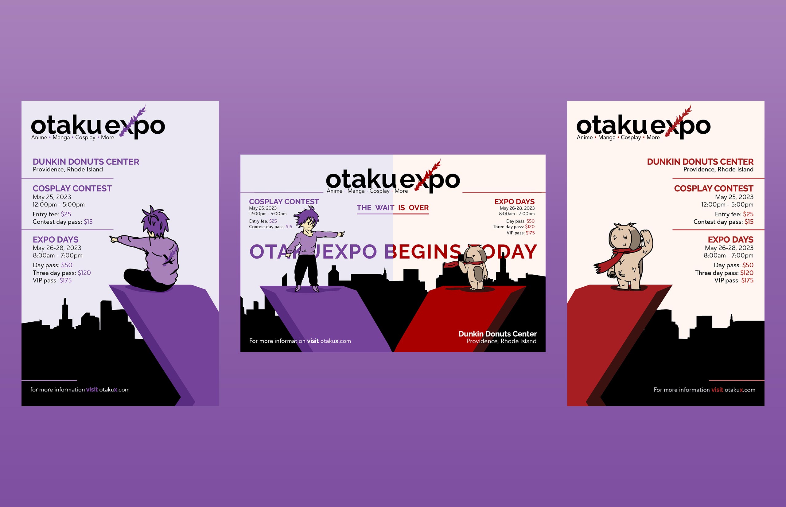
After developing a strong vision for where to take the design, I developed the designs of my mascots and recreated them using Illustrator. I then shifted my focus over to the brand identity of the event, designing a logo as well as landing on the typography and colors to use through the poster series. To stand out from most other conventions that use bright flashing colors such as pink or red, I went with different shades of purple for my first poster and a darker crimson red for my second. The colors would be the main driving force behind the final poster. To explain the concept of this poster series, the goal was for each poster to tell a story that led to the third postering being a climax final poster that would represent the start of the convention. The first and second poster would show each mascot as they stare over Providence with the final poster representing the two as rivals to encapsulate the audience and bring excitement to the start of the event.
Following the completion of the brand identity and character designs of the mascots, Experimentation with layout began. Using Adobe InDesign, Exploration into typographic Hierarchy was the main goal once all content was laid on the page. After printing the initial designs, many problems emerged with font size and typographic hierarchy that needed to be tackled to create a successful event poster. I returned to InDesign and played around with size, weight, and color until landing on the final layout.
Wrapping Things Up
The development of the event poster series was one that provided a lot of enjoyment from start to finish. When designing with passion, the excitement of creating never leaves and pushes me toward the completion of this project. Exploring character design, something I enjoyed a lot in middle school, was enjoyable and made this project stick out as one of my favorites. Being able to dive into typographic hierarchy was an important milestone and one that I wish to learn more about as I see it as one of the most important elements in any design.