An Informative and Visual Dive Into the History and Anatomy of Two Iconic Typefaces
Intro
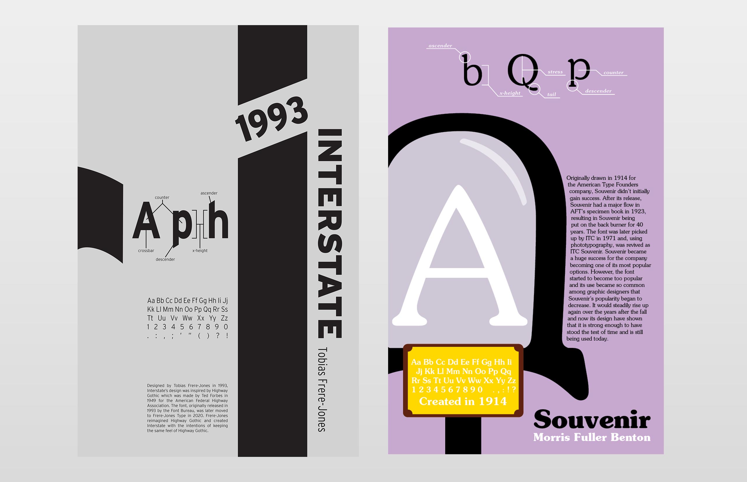
Tasked with the research and design of a type history poster, I was initially hesitant when diving into this project. Knowing that research into a typeface would be the backbone of this design, it was important to choose a font that stood out to me. Given a list of 100 unique typefaces to pick from, I opted to go with Interstate designed by Tobias Frere-Jones and Souvenir designed by Morris Fuller Benton.
Design Approach
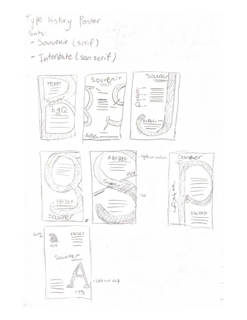
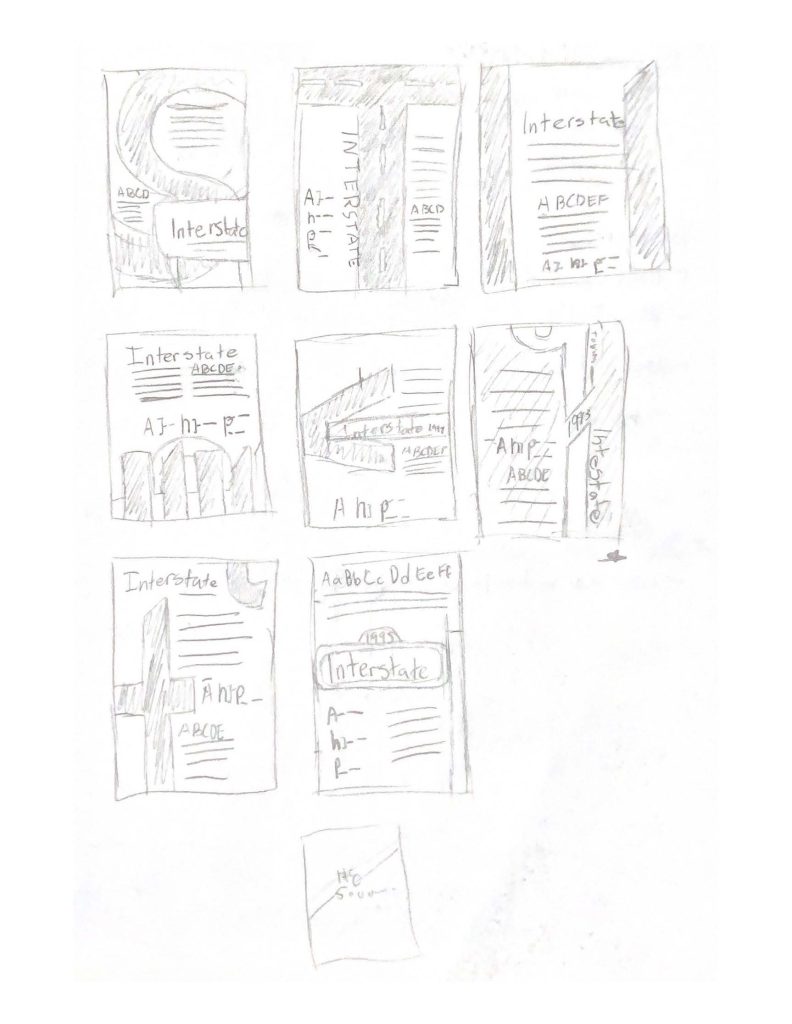
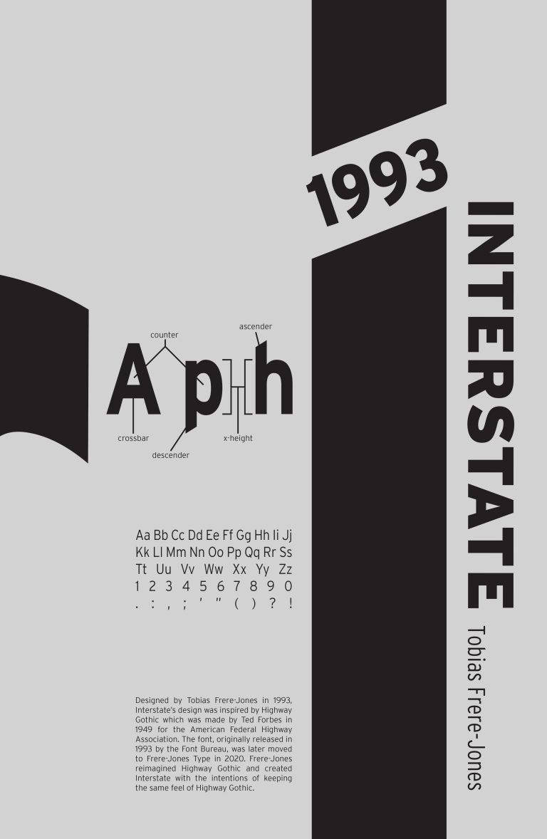
The beginning of the design process was no different than any other project as it started with research, however the research would be the lengthiest start to a project thus far. Researching heavily into the origins of each font, inspiration, development, etc. I drafted a summary of information that would be featured on each poster. Following that, I investigated other type posters as well as the anatomy of the fonts I chose as inspiration before sketching out layout ideas. After completing thumbnail sketches, I pursued a couple designs before ultimately landing on a design for both posters. The first poster I designed was Interstate and I took inspiration from the triangular points that appeared on some characters. Laying out the design using Adobe Illustrator was a challenge as it wasn’t something I was used to designing layouts in, I prefer using Adobe InDesign for that. Nonetheless I finished designing the Interstate Poster and moved onto Souvenir.
Original Souvenir Poster
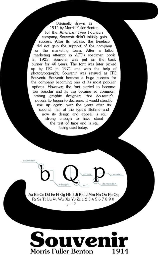
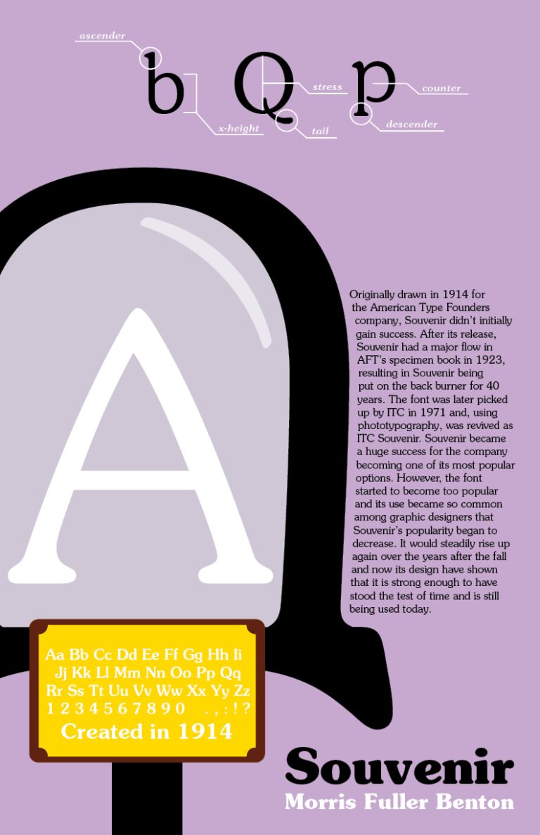
After finishing my original design of Souvenir, I left feeling very unsatisfied and when the opportunity came to revisit it for my portfolio, I knew it was my chance to redesign it. Taking a completely different approach, I opted to get inspired from the name rather than the anatomy, which was the main inspiration of the first iteration of this poster. I used a letterform to represent a souvenir or piece of art on display. Using elements from my original poster, such as the anatomy and history, I finished the new poster with that feeling of dissatisfaction finally gone.
Wrapping Things Up
Completing the type posters was an accomplishment that at the time left me with mixed emotions. Being happy with the design and layout of the Interstate poster and not the Souvenir, one always had me wanting to revisit and finally being able to let me feel confident about the posters. Looking at typography in a new perspective allowed me to appreciate the work that goes into the development of a new typeface and enjoy the beauty of letterforms. Typography is a big part of design and understanding it can be helpful as a graphic designer. The type history posters helped me better understand type anatomy and choosing which typography to use for a design, strengthening my skills as a designer and allowing me to make more educated design decisions.