Font Cards
Exploring Typography Through Deliberate Layout and Package Design
Intro
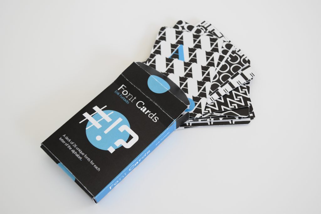
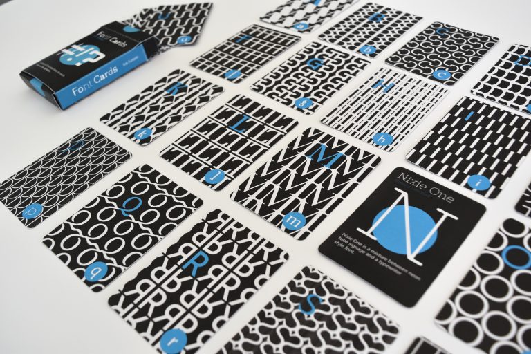
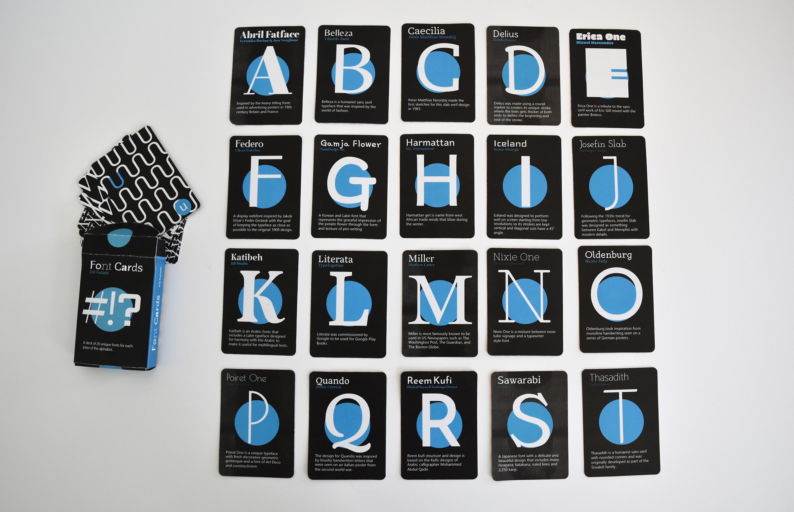
An interesting opportunity to expand my knowledge of typography as well as design for smaller surface prints came to me in the form of a deck of cards. Tasked with developing a 26-card deck with each card showcasing a different font, this project had me excited from the very beginning. This project would be my first exposure to small print design in college and I was drawn to the challenge. This project required me to pick 26 unique fonts that would each display a letter from the alphabet. Each card in this “Font Deck” would have two sides, one an information side displaying the font and the other a pattern formed from the letter.
Design Approach
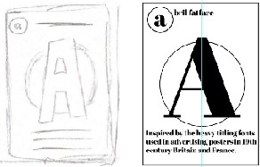
The main goal of the early process this time around would be to find a universal design that could be repeated onto each card and would still work with the 26 different fonts I chose. Each card included the font name, creator of the font, and a fact about the font. There would also be a large letter on the front of each card that represents the name of the typeface for that card.
The approach to color this time would be different than previous projects with the design consisting of a black background and white text, with design details highlighted with a pop of blue. After an exploration of all 26 fonts, I found a flaw in my original design. With 26 different fonts that each have varying weights and x-heights, the size of the body copy would not align. To solve this problem, I selected a font that would be used universally on all 26 cards for the body copy only. After spending time tweaking the layout and exploring different pattern designs for the backs of each card, all 26 card designs were completed.
Following the card design came the design and development of a box that would hold the 26 cards. After spending some time researching deck boxes, I decided on a size that would hold all 26 cards comfortably and designed a box that would correspond with all cards in the deck.
Wrapping Things Up
With the digital development of the cards completed, the time came to print the deck of cards. After some initial trial and error, I figured out how to align the front of my cards with the back properly. When it came time to print, printing error after printing error began to emerge. These issues were unable to be fixed like streaks or in my case weird gray blotches on my black backgrounds. The final submitted at the time had these gray smudges that appeared on my card that were unavoidable. The printing issues did not deter me from the accomplishments that came with completing this project. I was able to design for a smaller space, experiment with pattern design, and explore a plethora of fonts. All these factors allowed for the creation of a clean and unified deck of 26 cards.