
Minizine Design
Expressing Creative Layouts and Ambition Through Editorial Design
Intro
When initially tasked with development and physical creation of an 8 page “minizine” I had instant ideas for where I could take it. The initial excitement would carry over in the coming weeks as I began to research magazine design and gather inspiration to help in the design and formatting of the magazine and 2-page spreads. The content of the magazine focused on tech and life, centered around the future of technology and its connection to and effect on everyday life. Named “doubleclick,” the magazine was designed with teens to young adults in mind. To align with the demographic, the design was sleek, and content was made with the target audience interests in mind.
Design Approach
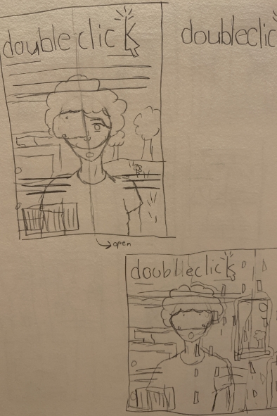
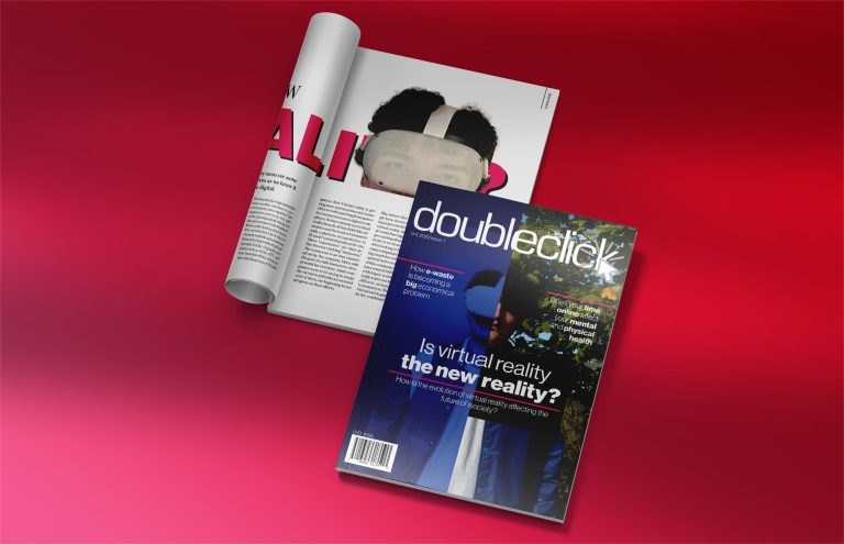
Following the creation of the name, I began the design and development of the masthead. Keeping the size of 7in x 10in in mind for the cover, I knew my ambition would push the boundary given to us. Challenging this constraint, I conceptualized a folding cover design inspired by a recent Vogue magazine issue my mom had lying around the house. The new magazine, when folded out would measure 10.5in x 10 in, this additional 3.5 inches would cause difficulties later. After developing the brand identity for the magazine and deciding on the fold concept, I moved forward with sketching thumbnail ideas for the cover. After the ideas were on paper, I picked a few to pursue further and created rough more detailed sketches. Once finished, there was one concept that really stuck out, a half and half VR vs real life concept that when folded out and expanded, would reveal a glitched out version to emulate the merging of reality and digital.
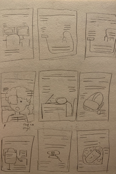
One of the biggest restrictions for this project was that all parts of the magazine, from the photos to the articles, needed to be created by yours truly. The article topics were developed early on, and the writing was tackled first before designing to figure out the amount content I had to work with. Once finished, it was back to thumbnails to come up with layouts for the inner spreads. A consideration for the layouts would be the types of content for each spread as it was required to have a regular article as well as an interview. Thanks to my prior research on magazine spread design I learned about key features and differences for articles and interview layouts. After finishing the sketches and gathering my thoughts together, my focus shifted to gathering the imagery needed for my spreads. After editing the images in Adobe Photoshop and finalizing their formatting and cropping, I laid out the copy, and started shifting my design from my original sketches.
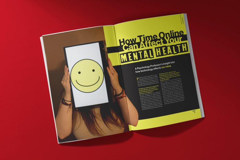
After experimenting with a variety of fonts, column layouts, spacing, and color, I landed on the final layout for my first article. The planning for the interview spread did not go as smoothly. For the article I interviewed Professor Jessica Fede, a psychology professor at Johnson and Wales, on technology’s effect on mental health. The original idea for the interview article was a one spread layout that had one page filled with an image while the written article would fill the other half of the spread. I ran into a couple of issues while trying to format it this way. The first of which was that there was too much content if I planned to stick with my original layout design. There were two solutions to pick from, 1. cut my content down to fit one page which would leave me with about 20% of the interview, or option two, continue the article to a third page. After deciding to pursue the idea of a third page the formatting of the interview was next on the checklist. Following that was the decision of how to lay out the header for the article. I experimented a lot with colors and fonts until I landed on the format seen in the final design.
After the articles were finished there were only two pages left to tackle, a creative piece which as described by my professor was anything creative with basically no restrictions, and a Johnson and Wales ad. For my creative piece I used an original, creative photo as the focal point of a Photoshop ad. Glitching the original image to fit with my magazine cover, proper branding was added to the bottom to simulate a real ad for Adobe Photoshop. The Johnson and Wales ad was focused on Johnson & Wales’ design program, rather than the school itself, but formatting and creative ideas became a struggle until ultimately pursuing a diamond design that reflect Johnson & Wales branding.
Wrapping Things Up
Once the layout was finalized, it came time to print. The make-or-break moment for any project and let’s just say it was not a fun experience. There were major challenges throughout the printing journey. First it was the complex custom document that needed to be created specifically for my cover due to its bigger size, then it was ghost boxes which were squares that appear on the background of an image that has a transparent background (PNGs), and then the printer that was being used began to print streaks of white on the magazine, and then the design was not lining up when folded due to the printers printing 1/8th of an inch off, and then I ran out of 12 x 18 in paper which is what was needed for the cover, and so much more. In the end I was able to successfully print, trim, and present my minizine to my peers and professor and then afterwards took a much-needed breath of air. After concurring challenge after challenge, I felt relieved to be done but also proud of the work I made. This project was a steppingstone for me as a designer and I feel that I was able to evolve and grow because of the restrictions, challenges, and solutions I faced with this project.
Programs Used:
Adobe InDesign, Adobe Photoshop, Adobe Illustrator
Year:
2022
Fields of Focus:
Editorial, Layout, Branding, Original Photography, Print, Typography