Ghibli Museum Website Redesign
A New Digital Look That Stays True to the Pre-existing Brand Identity
Intro
The assignment of redesigning a museum’s website left me stuck. With the many museums out there, I struggle to pick one to pursue. I investigated museums that were about my interest and landed on the Ghibli Museum in Japan. Although nothing stuck out as ugly or bad, there were still some improvements to the overall layout design of the homepage.
Design Approach
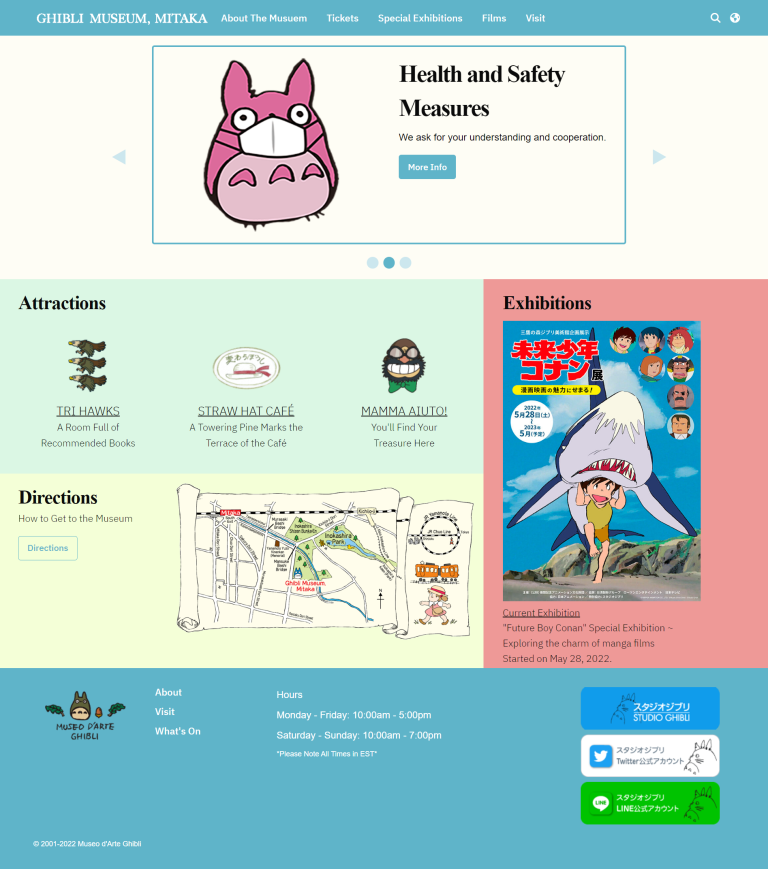
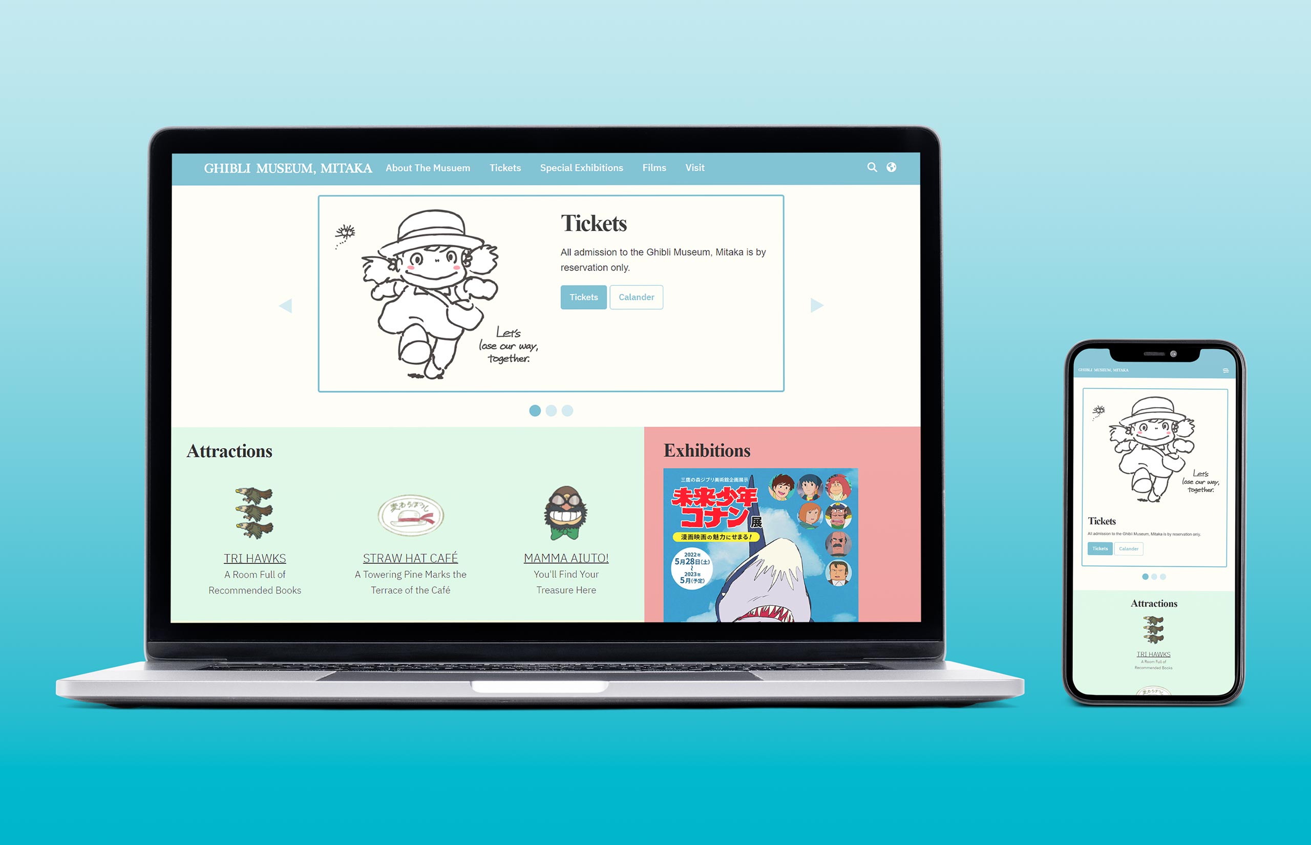
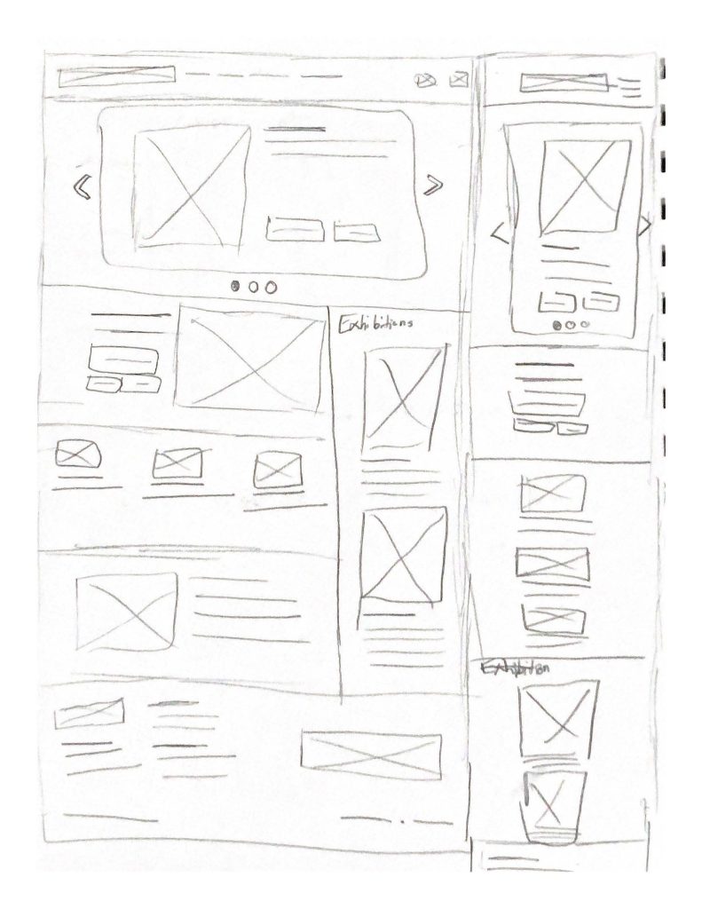
After sketching out wireframes, I recreated my layouts in Adobe XD and further developed and prototyped the layout to work for both desktop and mobile. The concept for the redesign was to use color blocking to shorten the length of the home page and give the user the information they needed fast and easy. With the vision of my design polished, it was time to translate it to HTML. Using Foundation Framework to assist in the structure of the site, I began construction on the header and hero.
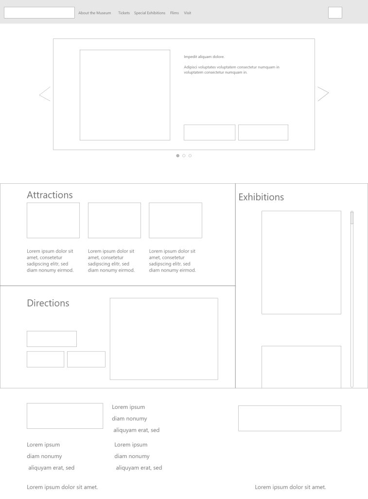
The concept for my hero was to create a carousel to welcome users and provide some additional information that was originally further down on the initial Ghibli Museum website. There were some challenges that I came across trying to use Foundation’s carousel but after some tweaking and help from my coding professor, the hero was finished and working on desktop. Another challenge I ran into was my color blocking section. The idea was to have two rows of information next to one column for events that stretched both rows. This layout was tricky to figure out a work around since Foundation Framework has strict rules built into the code. However, after breaking and reconstructing the HTML and CSS to work for the design, the information section was completed, and the last thing left to code was the footer. Due to my simplistic layout of the footer, things ran smoothly, and I was able to develop this finished design quickly.
After the desktop was all set up, it was time to right a whole bunch of media queries for the mobile version. There were a lot of things that needed to be considered when shrinking my website redesign for mobile users. Most of which was straightforward such as shrinking the size of type and images to fit the screen and condensing everything to one column. But there were some other changes I needed to think about that wouldn’t make sense on mobile, the most important thing being my exhibition section which included a scroll on desktop. I figured this would be both stupid and a pain for mobile users, so I opted to expand the section and get rid of the scroll on mobile.
Wrapping Things Up
With the mobile and desktop version completed, the final step was transferring them over to my domain. Although not as complex as some of my other web projects in terms of layout, the redesigned website was able to accurately represent the pre-existing brand identity already established for the Ghibli Museum. The use of pastel colors brings some variety to the page while also working to create clear separation to assist users in finding information as fast as possible.